Shoutout to James Davie for suggesting this.
For this list I will be including films from the past to the present. For added toughness i'll be sure to make it a 1 entry per series film list. This was super tough to list and is not the definitive list as my opinion will change from time to time but this is the list I chose as of writing.
Halloween
Proving that even the humble pumpkin can be considered menacing, Robert Gleason’s demonic nightmare is arguably unmatched among horror one sheets. We only see Michael Myers’ hand here holding his signature weapon along with the menacing pumpkin face, but his presence is felt heavily especially in it's tagline, with the ’He’ suggesting so much from so little.
Alien
A poster that’s become synonymous with Ridley Scott’s chilling space horror in spite of the fact it looks absolutely nothing like the Xenomorph eggs that appear in the final film. A simple visual cracking egg, creepy glow, alien bio organic texture on the floor matched with the title and beautifully finished with the film’s chilling tagline it's very foreboding.
The Truman Show
Photographic mosaics are a plenty these days but in the days of the late ‘90s, this poster was something of a design trailblazer. It also makes perfect sense for visually communicating Truman Burbank’s life, continuously observed by reality TV cameras, in a single image. Supports the brilliant film nicely.
Lord Of War
At first glance, it’s a straightforward headshot. Look closer, and it’s a headshot in more ways than one: every fragment of The Cage is made up of bullet and shell casings. It’s a meticulous mosaic of militarism, and it works like a treat. This was a decent film aswell one of Cage's best.
X-Men: Days of Future Past (2014)
The images resemble the wanted posters featured in the original comic, and thanks to the film’s time travel plot, both the younger and older versions of Professor X and Magneto appear onscreen. These character posters visualise that by overlaying the younger actors’ faces over their older counterparts. The placement of the X over the characters’ eyes draws the viewer’s attention to the perfect spot. And instead of bothering with unnecessary text, the designer just put the movie’s release date in the lower right hand corner. The minimalist style works because it highlights characters the audience already knows and loves.
More precisely I chose this trilogy teaser poster, it's simplistic but the lighting showing most of Frodo, his clothes and background as dark represents the dark path he must take ahead of him to destroy the one ring which as you can see in the poster it's brightly lit signifying its importance and power. Not going to lie it's one of my favourite films and trilogies in existence aswell so had to throw it in here.
Avengers Infinity War
The most recent entry on this list is this blockbuster powerhouse costing over a billion to make and it's earned double that as of writing I believe but this film features the big heavyweight actors of modern day Hollywood and it's colour scheme is eye catching yet hides a darker tone to it with it's colours too.
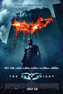
The Dark Knight
Why so serious? This is one of a couple of posters used for the film which was brilliant. I love how dark and serious this poster is showing us that what we are about to see is a dark dramatic tense superhero film and that's what we got. The Joker's why so serious one shows the same and there's a sense of unpredictability aswell in the poster with the Joker writing why so serious on a mirror or piece of fogged up glass and it seems to be coming from his face from his smile. Brilliantly designed posters for such a brilliant film.
V For Vendetta
Anarchy reigns strong here in this eye-catching colourful poster for one of the best film's in modern times hell even all of time I would argue. The red and black colour scheme used is telling us the viewers that this film is powerful, sophisticated and passionate quite the intimidating combination.
Star Wars (EP 4)
Tom Jung’s striking theatrical poster for Star Wars is such a classic and it's an iconic stand out among films in the sci-fi genre and all other movie gerne's for that matter in my opinion. Composed around a ‘good vs evil’ concept it's a straightforward poster, Jung used the lightsaber’s unusual cross motif against the dark of Vader’s helmet to convey the film’s moral struggle. The title style here is a direct nod to the opening crawl.
And that's my list, thanks for visiting!
COMMENT/SHARE/FOLLOW ME ETC
Stay shiny see you next time :)


No comments:
Post a Comment